Monday, April 30, 2012

A Different Kind of Design Wall


My design wall is mostly unchanged from the last time so I thought I'd share some photos from the small road trip we took yesterday.

These cattle are Scottish Highland cattle -- living here in Wisconsin.  The ones in this pen are yearlings -- they were calved last year.  The one with the horns is a sweet girl.


They reside at the Fountain Prairie Farm up in Fall River, Wisconsin.  I forgot to take pics of their people,  John and Dorothy Priske.  The Priskes run a Bed and Breakfast (here is a link) and kindly allowed me to photograph their wonderful cattle.  They also said that I could come back!  They're expecting some calves soon, so I hope I can capture them on film.


I have to say -- aside from my fascination with these beasts, I had an ulterior motive for wanting to photograph them.  I'm planning my next quilt.


This friendly horse lives on a farm much closer to home, we stopped there after we left Fountain Prairie.

So which one is best?  Who should be the "Wild Thing?"

To see more traditional design walls, click here to go to Judy's blog.  

Friday, April 27, 2012

A New Book, New Fabrics, and a New Finish

First up:  I'm a winner!  Intrepid writer, quilter, dyer, and all-around-famous-person Laura Wasilowski chose me as winner of her latest book: Fanciful Stitches, Colorful Quilts!


This book appeals to me on several different levels. It has easy projects featuring really bright hand-dyed fabrics.  As people who know me know, those brights are near and dear to my heart.

It contains several pages of embroidery stitches.  I already knew how to do these stitches, but it's handy to have them together and illustrated with really bright threads.   Also, Laura combines them in interesting ways and has before and after photos of quilts showing the impact of the embroidery.  And I love the chart that shows which needle to use with which size thread.

But best of all, it's a recipe book for quilts that seeks to teach and inspire, not just provide rote follow-my-pattern stuff.  In my favorite of the "tip" boxes scattered throughout, Laura suggests: "Add your own creativity.  Cut fabric shapes freely or with decorative blades.  Ignore the photo and placement guides and arrange the design elements to your liking."  Yes!  Thanks, Laura!

 These are my latest monoprinting experiments.  Nienke blogged about it here on the "...Fire" blog.  I used thickened dyes instead of the soap trick.  They don't look much like flowers to me -- more like sea creatures.

I've been playing around with flour resists again.  I did these with rice and wheat flours and some plastic stencils.


I'm going to be experimenting a bit more with these before I post a how-to.  I like them, but I'm not thrilled with the results.  More on that later.


I finished the Japanese Taupe Blocks bag. This is the inside front of the bag.


And the backside.


I added a zipper compartment inside.

My favorite parts of the bag are the box pleats on the sides.  The instructions for this are in the book we're using for the 2012 BOM here.  The author, Susan Briscoe, has a blog here.


And this is the appliquéd front.  I love the way this turned out.  I am considering making another.  In eye-popping brights this time, though.  And more pockets inside.

To see some other appliqué projects, click here to go to Angie's blog.  

Monday, April 23, 2012

Design Wall Stuff


Today my design wall shows a bit of progress on Neptune/Poseidon.  And a bunch of other stuff -- I love those two reddish monoprints and I'm still not sure where I'm going with the stuff on the right.

I did finish quilting the squares for my new bag.  Now I just have to assemble them.  Of course, it's not that easy.  I want to put a zipper compartment inside and that's not part of the pattern, so I'm going to have to rewrite it.

Check out other design walls here on Judy's blog.  

Friday, April 20, 2012

On Friday, Appliqué Update Thursday


I have returned to the Poseidon piece.  In the moving piles of stuff around that passed for creative endeavor this winter, I lost his trident!  He can't be Poseidon/Neptune without it!

But I found it.  Under a stack of fabrics vaguely related to this project.  I am still playing with the seahorses.  That bit of fabric where a horse tail would be is a fin.  That I'm not finished with.

I got out the Tsukineko inks and gave Poseidon/Neptune some features -- hair, eyes, and (ahem) some muscles.  I also did a little bit of inking on the seahorses and the turtle.


 And I have finished this needle-turn appliqué block for my new bag.  I used variegated perlé cotton thread for the running stitches in the center of the flower.  I had to do the set-in circle more than once.  The first time, I cut the circle from the butterfly background too large.  So the hole was too large.  Then I cut it out correctly; but when I went to square up the block after the machine stitching, I cut the block too small.  So I picked out the stitching and made another butterfly background piece.  The third time was a charm!  Not too big or too little, but just right.

To see other appliqué projects, click here to go to Angie's blog.  

Monday, April 16, 2012

Design and Flowers

On my design wall today are three blocks for my latest bag.  I finished this much of the appliqué on the leftmost one.  It still needs a center and a bit of embroidery, then I'll be able to make the bag.


 And while last night the temperatures plummeted from lovely spring to late fall, I have an assortment of pictures of spring flowers.

These seem really early this year -- no doubt a result of record-breaking March temps.

 These irises greeted me this morning.  Last night, they were tightly budded.


I love the ferns as they're preparing for their final unfurl.


 And the stupid fake fruit tree is in its week of glory.  It is covered with these masses of white blossoms.  I cut off all of the low hanging branches last summer so we could mow the lawn without decapitation worries.  The branches that are left have gone out of their way to make up for the missing limbs.


And because I haven't posted one in a while, here is the gratuitous dog pic.  Rosie loves the snow, but she enjoys spring mud also.  This is after the bath.

There are other design walls here on Judy's blog.

Saturday, April 14, 2012

Socially Acceptable Mud

 Years ago, when my eldest son was in preschool, I got "talked to" about his behavior.  Okay, I got "talked to" a lot about his behavior (and, to be fair, that of my other kids too).  But this particular time, it was because he and a couple of his friends had discovered a corner of the play yard that was bare of grass and when water was added to this particular patch, a lovely mud developed.  It was great fun to use the mud for sculpting and painting.  Of course, his clothing suffered, but generally this particular son was pretty fastidious for a little kid.  So I wasn't worried about the mud.

Not so, the other parents.  Apparently my son was the ringleader in the mud art projects and had to be stopped.  I remember his sorrow as we rode home from preschool the first day after the mud artwork was halted because it was no longer allowed.  He was so sad.


I have a birthday coming up.  It happens every year around this time (no, it's not yet, so please don't make a fuss).  But I decided some time ago (actually, a very long time ago) that I would remain at 27.  The rationale for this was fairly simple.  If you say you're 29, everyone assumes you're lying.  At 27 -- you just might be telling the truth.  And thanks to fortuitous genes, I could carry it off much longer than was really fair.  But now, it's kind of a joke when I say I'm 27.  And that I have my annual 27th birthday each year.


Another reason I refuse to divulge my actual age is that I've found that people seem disappointed when they find out how old I really am.  Like I should act more mature or something.  Oh puleeze!  Apparently, there is a fine line between childlike and childish.  And for some reason, I skirt much closer to ish than like.  And ish is just not as socially acceptable as like.


But I have found that my son was right to be sad.  It's fun to play in mud.  And who cares if you get a  bit dirty?  Especially if you're dressed for it.  And now I've found a socially acceptable mud.  It's called: dye thickener.


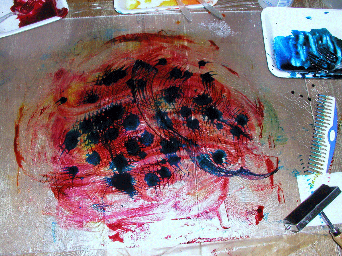
I procured this large piece of plastic (I believe it's a tile for a drop ceiling) and found that if I spread dye thickener on it I could have a great time smooshing it around and adding thickened dyes to make prints  (there is a much more clinical description of this process on the Fire blog here).

I have long looked for a method of marbling with thickened dyes.  I haven't found it yet, but this is close.


I used the plastic combs from my marbling stuff to swirl the dyes on the plastic.  And skipped the "stuff" I was using for resists.  I rather like most of these pieces -- yes, there are a few that are dogs -- but I can use those for further research in my other evil experiments. Bwahahaha...


Thursday, April 12, 2012

A Good Day to Dye

As promised, here are some results from my deconstructed screen printing.  I have only two screens (but I'll have more soon!), so this is the result of several days of dyeing.


 Thanks to the magic of photoshop, this has more contrast in the photo than the actual fabric.

 This is one of the first ones that I really like.  I discovered that using slightly thinner dye paste to make the print allowed more of the dye to dissolve onto the fabric.


 This one is pretty meh -- it has a bit more contrast in real life than here, but it's kind of nice texturally.

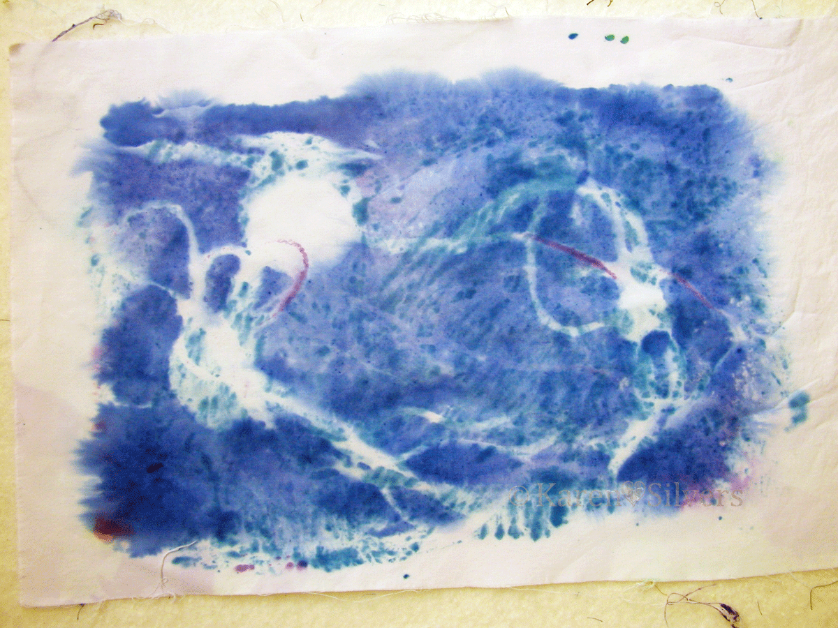
The background on this looks blue on my monitor, but it's not.  It's really white.  I love the dots.  

And this one looks kinda pinkish.  But it's not.  The colors on this are pretty soft.  I think I need to use more dye in the paste.

I really like this technique -- it's highly addictive.  If the weather would cooperate and warm up, I might get to do more.  I did do the last two inside, but I made a mess of the kitchen and cleaning it up and then cooking dinner wasn't a lot of fun.  So I think I'll try to do this outside (my neighbors probably love the craft table that is set up on the front porch...).  

Tuesday, April 10, 2012

Tuesday - Monday Design Wall

Yeah, I'm a bit late on this -- my design wall for today holds a bunch of unrelated projects:


I'll "splain these below, but first -- a report from my 2012 BOM group (more about that here) -- yes -- I was finally able to attend.  And I had this month's assignment finished!


 This block is called "Kakuyose" (Parquetry angles).    


Then we started arranging them -- it would make me crazy to make this many of a single block -- but it's a lot of fun to have them all to play with.

I usually do this in EQ7, but it's great to see them in "real time."


And the whole group on point.

This is "Kunojiki sujikai" or simplified right-angle braces.  I like the way some people used the background fabric -- the two on either side of the one in the top middle are really nice examples.


 "Tokiwa gaki" (Ordinary fence) Not so ordinary, if you ask me.  You might notice that the one on the top right has fence posts that hang off the bottom a bit -- that's what happens when you measure the center piece at 4 inches instead of 4.5 like the directions say (yep -- that's mine.)


These blocks are from the same book -- I did them in the spa blue and brown combinations because I want to use them to make a bag.  
And this is prepped for the appliqué block that goes on the front of the bag. 


This stuff on the left is also for a bag -- it's free-form pieced and I'm thinking of using it for my new spring bag.  I'm not crazy about it yet, so I'll have to do some more to see where it takes me.

To see more design walls, click here to go to Judy's blog.

And I haven't forgotten that I was going to post pictures of my latest screen print experiments.  The kids were off for spring break and I got busy.  Also, Mr. S finally made some new screen frames for me -- I haven't added the silk screen to them, but maybe by next weekend...

Monday, April 2, 2012

April Design Wall


My design wall for this lovely day in April sports this polka dotted wonder.  I spent last Friday with the friendly ladies in Monroe, Wisconsin.  We worked on this pieced wonder.

It is from a pattern called "Strip Stacks" by G.E Designs, Iceland, at: http://gequiltdesigns.com/.

For more design walls, click here to go to Judy's blog.

Sunday, April 1, 2012

April: Fooling Around With MonoPrinting


This month, I am "up" at the "Fire" blog.  This is a reprint of my post from today:  I have always wanted to try monoprinting on gelatin.  But the surface seemed so small and, while I do like to use paints and acrylic inks, I really wanted to try it with thickened dyes.  So last month, in preparation for this month, I started playing around with various thicknesses of thickeners to see what would work best for me.  I'm still playing (and I intend to play around with paints later this month), but these are my findings so far.


First, I needed a gelatin surface.  I rejected pie plates as too small and the sheet pan I wanted to buy from my local restaurant supply as too large (with the early spring, my "drive-in cooler" is way too warm to chill the gelatin) and settled on an old glass 8.5" by 13" dish.  This dish can no longer be used for brownies now that it has found its way into the dye studio, but I really don't need those calories (and in a pinch, I can always purchase ready-made brownies).
I did a little research and discovered that one tablespoon of powdered gelatin to one cup of water is about right for optimum wiggle vs. solid.  I filled the glass dish with water to determine the amount needed (8 cups) and poured a little less than half that of cold water into my studio mixing bowl (again, we don't want to mix up the studio stuff with the kitchen stuff).  I sprinkled in the 8 tablespoons of gelatin.  I mixed it with a whisk and let it soften while I boiled additional water.  I then added the boiling water to the 8 cup line and stirred it with the whisk.  While the gelatin cooled a bit, I sprayed the glass dish with Pam so that the gelatin would pop out easily.

 I poured the gelatin into the glass dish, covered it with plastic wrap and let it refrigerate overnight.  I didn't try to skim the bubbles or anything because I planned to use the other side for my prints.


The next morning it was set and and I inverted the dish on top of the plastic wrap so I could use the wrap to put it back into the dish when I was finished for the day.  I did find that sometimes I had to help it out of the dish with a plastic fork, but generally it popped out easily -- especially after it had been used once or twice.  When it started coming out of the dish in pieces, I just pushed them together and used it anyway, but replaced it soon after that. 

Blobby dyes -- okay, but not what I was looking for
I tried various degrees of thickened dyes -- I have a lot of really thick dye thickener from last month's experiments -- but found that when I added liquid dye concentrate it was globby and made my prints blobby.  I kind of liked the effect, but I really wanted to use smooth dyes.  I found that mixing the thickener as for dye painting and then mixing the dye powder directly with the thickener worked best.

The measurements that I used were as follows: for one quart water, two teaspoons of thickener.  Then add to that mixture one tablespoon dye powder for each cup of thickener.


I don't have a blender that I can donate to my studio right now (it's still needed for those pestos and certain summer drinks) so I found that if I sprinkle the thickener powder into the water while whisking, I can get a mostly lump-free liquid.  Let it hang out in the fridge overnight and it's perfect.  Just stir it up before measuring it out for the dye -- I use my trusty dye studio whisk.


After it's been used a bit, the gelatin takes on some nice color, but if it is wiped off, the color doesn't seem to transfer to subsequent prints.


I put the thickened dye in a plastic tray (I use these a lot for paint palettes) and spread it on the gelatin with the hard rubber brayer.  It seemed to work the best, the spongy one absorbed the dye and didn't lay the dye down on the gelatin.


I arranged some "stuff" on top of the thickened dye to act as a resist.  I discovered that flatter is better for "stuff" because I like crisp edges.  The plastic lid stuck up too high and I used a cutout circle of thin cardboard for later prints.


I laid a soda-soaked piece of fabric over and used the spongy brayer to smooth it down.  I need to get another hard rubber one because the spongy one absorbed dye and left it in places where I didn't really want it, although it worked well to smooth the fabric over the less-flat "stuff."   I soak my fabric in soda ash solution and spin the excess liquid out in my washer -- I did use some pieces that were still damp and it didn't seem to matter much.


After peeling the print off, I removed the resist "stuff," put down another piece of fabric and got some lovely negative prints.   I laid the prints in a single layer on thin plastic garbage bags that I had cut open; then I folded them up and let them batch overnight.


Some of the negative prints were less interesting and I put them on a pile to "overprint" later.  Below are more "finished" prints.


This last one is my favorite.  The strings were pretty saturated with dye and left lovely "ghost" marks on this one.  Also, I moved the fabric around on the gelatin so that the dye covered the edges.

I plan to do more with this -- I'd like to experiment with warm colors.  Also, I want to play around with acrylic paints and inks.  But I'm really liking it so far...

Later this week, I'll post some photos of the deconstructed screen printing experiments.