Showing posts with label Setacolor paints. Show all posts

Wednesday, March 26, 2014

Clara Ruth


For my January Challenge over at Art Quilts Around the World, the theme was Art Deco.   So I googled it and came up with lovely flowing images of beautiful women.  I got out my big pad and drew this woman.

I used a soft pencil and some Copic markers for the colors.


 I traced her onto this most excellent batik from my stash with a black Micron pen.  I layered it with wool batting and stitched over the lines.  I couldn't get to my paints -- we moved house recently, which should account for my lack of blog posting and internet woes -- so I used the Copic pens for her eyes and lip colors.

I wish I had used something other than black marker for the tracing because it was a laborious job stitching on the lines.


"Clara Ruth"
11" by 14"

I used copper Setacolor paint for her locks and Auriful threads for all the stitching.  Her name was chosen by googling the most popular girls names for that era.  My daughter and I agreed that we thought Clara Ruth was beautiful.  


Friday, January 11, 2013

Hibiscus 3


The third in this series is painted with acrylic fabric paints (Setacolors) on cotton fabric.  I used wool batting and several different types of cotton threads.


I used wool batting and cotton threads.  I really like the colors in this one --  this one has the brightest colors and I find that most appealing.


The beetle was painted with metallic Setacolors -- I think I used copper and a bit of silver on the basic black beetle.  


The backside features my specially-dyed thread-boo-boo-camouflage fabric.


I am linking up with Nina-Marie and Off-the-Wall-Fridays... check it out here.

Monday, September 17, 2012

Three (mostly) Done, One to go


I've been  working on my hibiscus series.

This is the one that was painted with acrylic inks.   I used a cotton batt and cotton threads.

This was painted with thickened Procion dyes.  I used a wool batt for this one and cotton threads.
 

This was painted with Setacolor fabric paints and uses a wool batt and cotton threads.  I haven't finished the quilting here -- there will be more on the flower to highlight the petals.


And for Beth (who blogs here and to whom I owe a really long email) -- here is the backside of the acrylic ink piece.

I stupidly used a piece of white fabric -- it also features little white stars-- and so every stitch (and every mistake) shows.  I have had a lot of trouble with the thicker threads breaking.  I switched to a different type of needle late this afternoon and it was better.  Not great, but better.  I'll post about my needle troubles later.

I'll also post a picture of the backsides of the others -- but this will require a separate blog post, 'cause there's a secret back there...

My design wall looks the same as it did last time I linked up with Judy's blog, so I'm sharing these instead.  Click here to see some other people's design walls.  

Monday, July 16, 2012

Quick Monday Update


Just a quick update for Monday.  It worked!  Here is the dye-painted hibiscus.

I'm thinking of using foil to make the beetle sparkle.


And I've commandeered the kitchen table again -- this time for a rendering with Setacolor fabric paints.

For other design walls, check out Judy's blog here.

Monday, May 28, 2012

Playing with Stencils


  In the scrapbooking department of my local Joann's, they have some laser-cut papers that I thought would make great stencils.  So I purchased a few of them on sale and tried to figure out how to make them useful for wet media like thickened dyes.


I probably could have used paint, but in his personal stash of goodies Mr. S had this stuff that he uses to coat the handles of tools so that they have non-slip grips.

I tested some on notebook paper, and it worked!  The rubberized paper completely repelled water.
So I went out on the lawn (which I had mowed earlier that morning) and sprayed the rubber on the stencil.  Of course, now there's something more than the front porch with the plastic buckets and art table covered with plastic sheeting that whips in the wind to upset the neighbors.  I suppose they'll just have to continue to suffer for my art.

  
I used my new stencil to roll on some thickened dye and it made this piece slightly more interesting, but it's still not exciting.

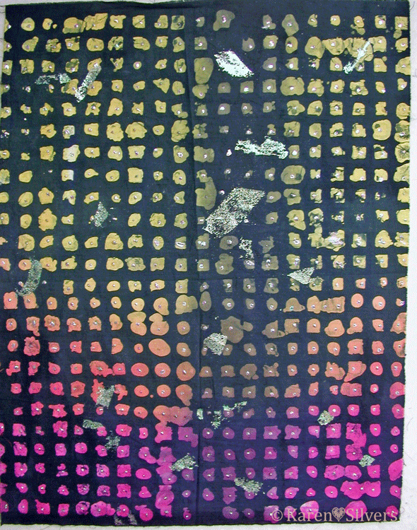
Being too impatient to use more dyes, I got out my Setacolor fabric paints in purple and fuchsia and rolled some on over the stencil.


And voila!  Much more interesting!


Then I got out a piece from the deconstructed screen printing that was really dull.  I had these sticks that are the same as the stuff that is inside colored pencils, but there's no wood -- they're all color.


I made this pressure plate with cardboard from a cereal box and hot glue.  I was going for a thing like Nienke had here on the Fire blog.    I didn't want to copy her work, but I loved the circular feel of the linocut she used.  


Hmmm... not very interesting.


I got out my stampers -- some I had made and some were purchased -- and I stamped and stenciled on the fabric with more paint.

 I'm not crazy about this piece.  I think that the colors of paint I used fight with the background color and make it look disjointed.  And the circular thing just disappears into the background.


For this one, I used a swirl of purple and golden yellow paints and rolled it on through a stencil.  There's no circular thing happening, but I really like this.  I think the colors are much better together and I could see using this whole or cutting it up and stitching it together with other fabrics.  

Monday, September 5, 2011

Curses! Foiled Again!

 Last week on my design wall, there was this piece of fabric that I had to do something to.  But I wasn't sure exactly what to do to it.

I finally decided to do some more foiling.  Yep -- foiled again!  But no cursing.
 Because it had already been foiled with glue, I used black Mistyfuse shapes and scattered them around the piece.  I really like the black Mistyfuse on the black background.  I had to be careful not to hit the previous foiling with my iron and I also made sure I worked around it with the fusible web.


I pressed the pieces of Mistyfuse, then added the foil on top.  I really like the way the foil isn't a solid blob -- it has the pattern from the fusible because the foil sticks only to the glue in the fusible web.


This is the final finished piece.  It was dyed, then waxed and over-dyed, then foiled twice.
 This is my final art cloth.  It started out as a snow-dyed madala, looking something like the piece on the left.  I know I took a photo of it before I sent it on its journey, but I can't find it.  Fortunately, I had two that were almost alike.

Beth from Maine was the first to get it.  She used something called "fugitive media."   Basically, it means that she used things that normally aren't permanent on fabric -- chalk pastels and water soluble oil pastels in this case -- then she painted them with base extender and heat set.  There is a much more eloquent explanation of fugitive media here at "...And Then We Set it on Fire."

Then Laura painted it with red Setacolor paint and sun-printed it using round shapes, foam cut outs and gravel from her driveway as resists.

Here is a detail showing the paint and the final foiling that Jenny did.  She followed the starburst design that happened during the original dyeing.  It's a pretty amazing piece.  I'm enjoying having it up on my design wall.

For other design walls, click here to go to Judy's blog.

Monday, August 1, 2011

Surface Design Redux

This is the piece I received for July in the Surface Design Round Robin hosted by the creative minds at "...And Then We Set It On Fire."

I held this one to the very end of the month (the time allotted) -- I was doing my stress-out thing because it has all this beautiful subtle color.  Initially, it was rust-dyed, then masked and painted with Setacolors.

I didn't think that my usual heavy-handed, in-your-face, gonzo approach to COLOR was appropriate here.  But what to do?  Again, this is not my fabric; it belongs to someone else and my usual approach to COLOR might not be appreciated.  Why not?  Well... ok.. not really sure why anybody wouldn't demand over-the-top color, but not everyone does.  Go figure.


 My first inclination was to add leaves and flowers.  I got out my hand-carved stampers and thought about it.  Hmmm.... then I got the bright idea of carving a new stamp -- a goldfish -- and doing a weeds in the water thing.  I thought I could mask off some of the greenish-yellow bars and stamp over them so it would look like fish hiding behind the weeds.  But then I didn't really like that idea for this -- I thought something more abstract would be better.  And I have the stacked triangle stamper and the curly cues.  Hmmmm...


I got out some of the sparkly Setacolors -- orange and lime green -- and mixed them with the lightning medium.  I used this because I was going for subtle (remember subtle?) and the color by itself is pretty intense. The lightning medium makes the color less intense without changing the viscosity of the paint --  very important when you're using stamps.    I didn't want runny paint.  I wanted nice clean images.

And here is the finished (for me, that is) piece on my design wall for today.  It's ready to send on to the next person.   Click on the photos for a closer view.

For more design walls, click here to go to Judy's blog.

Friday, March 18, 2011

Rice, Rice, Baby

I wasn't going to post about this.  It's more a failure than a win, but I am using the fabric that resulted from it.  So I guess I should 'splain it.

I took minute rice and cooked it according to the package directions, cooled it, and spread it on the fabric.  I let it dry, then painted on the thickened dye.  This is a half yard of fabric.


The reason it's a failure is that I couldn't get the rice/thickened dye mixture out of the fabric.  So this piece is rather stiff.  Not like cardboard, but not like a piece of good hand-dye should be.  I soaked it, washed it, then repeated the whole process.  Finally I gave up and threw it on the "hmmm..." pile.  Then I needed some bark-like fabric and I got the bright idea of using up some Setacolor paint I had stashed in a plastic container.  I diluted it, then painted it on the back of the fabric.  Then dry-brushed on some acrylic ink on the front in a darker brown.  That's the brown mess on the top edge of the fabric.

This piece is better.  I added some water to the cooled rice mixture before I spread it on the fabric.  This is not as supple as a normal hand-dye, but it isn't stiff.  I got most of the rice goo rinsed out.  This one and the next one are fat quarters.


This is the best piece.  I didn't have enough of the rice/water mixture left to do the whole piece.  So I added some rice flour that had been dissolved in an equal amount of water to the rice mixture (I think I had a half cup each of water and flour).  The goo rinsed out and this one is pretty good.  I don't think I would use this in a traditional quilt, but it will be fine for almost anything else.  And I think it has the best patterning.  It has that nice crackle from the flour in some places with the bolder look of the whole rice bits.  The background looks a bit blue on my monitor, but it's really white in real life.

Click on the pictures to examine them more closely.

It seems to me that things that are cooked stick to the fabric more than things that are not cooked.  I had trouble getting the potato stuff out of my fabric also, but no trouble at all with the rice and AP flours.  I have a package of glutinous rice flour to try next.  I'm curious to see if it will be different from the regular rice flour.

Sunday, May 2, 2010

Sunprinting and a Useless Tree

I hate this tree.  It is beautiful for exactly three days every year.  The rest of the time it drops nasty fake fruit everywhere that the kids track around everywhere in the house.  Even though there's a No Shoes In The House rule.  The leaves that it drops are too small to rake and its low hanging branches threaten to decapitate anyone mowing the lawn.


It is in the perfect place to provide shade for the back patio, except that it's a fake fruit tree and not a shade tree -- too short for shade.  So why not chop it down?  Because for a couple of days every year, I can use it for sunprinting.


When the petals from the flowers fall onto freshly painted fabric, beautiful things happen.


Rain was forecast for the entire weekend and I figured it would knock all those wonderful petals off the tree and onto the grass.  What a waste.  But to my joy and amazement, today was beautiful and sunny and not too windy.


So I got out my paints and my fabric and got my DH to help me move my table out onto the lawn under the tree.  Of course, the neighbors probably thought I was nuts: shaking the branches so that the petals would fall onto my painted fabric.  "What in the world is she doing now, Martha...?"


Or maybe they already thought that from the dye experiments that decorate the front yard.  "Look, Martha, she's at it again..."


These are the results -- heat-set with an iron, but not washed.  I always let them cure for a day or two after the heat-setting before I wash them  --not sure that it makes a difference, but it can't hurt.  Washing them gently with a little Synthropol makes them soft.


I never use fabric softener on my fabrics because I never know what I'm going to do next -- dye, paint, fuse, stitch -- I like to keep my options open and fabric softener limits those options.


Yep --those are my toes -- it felt like summer today!


And if I need it, I can get shade on the front porch -- as well as spy on the neighbors.

"Look, Martha, she's sitting there reading a book and drinking..."  Hmmm....

Tuesday, February 9, 2010

A Little Bit of Paint and Some Big Blocks

After heat-setting the diluted paint (thanks, Jill), I washed and ironed (again) these formerly white on white fabrics. I like the pale colors and the subtle textures from the scrunching.


The group that I meet with once a month decided to do this pattern for this year:


It's a sampler quilt with lots of options (for those of us who prefer to do our own thing) and the blocks are varied enough that they're interesting for advanced quilters, but easy enough for the more novice among us.


Since I had to return to my un-real job last week (after a six-week layoff), I have to get back in the swing of things and relearn how to budget my time. So I'm two months behind on blocks (and haven't posted in almost a week). I took a snow day today and finished this block:


It's called "Queen's Petticoat." For Christmas, my daughter gave me some beautiful batiks in watery blues and greens. I added some more from my stash and the fabrics I painted in my last post.

Being a fan of tedious patchwork -- why do easy if you can make it hard? -- I decided that the nine-patch in the center of the other January block was just too simple. So I got out my graph paper and drafted this star. I paper pieced it using the freezer paper technique.


This block is called "Mrs. Lloyd's Favorite." After I made the center, I thought it might have too much white space, so I made a Lemoyne star for the center. Yes -- one of those diamonds is a scrap of my own hand-dyed marbled fabric. It's left over from a quilt I made for my son -- I finished the top, now I just have to quilt it.


Now I have to decide which to use. Any suggestions?