Showing posts with label resists. Show all posts

Sunday, August 12, 2012

Can't Resist Those Sweets

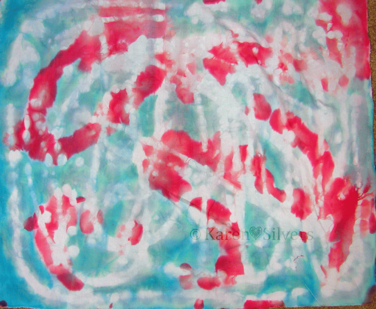
 Over at the "...Fire" blog we are doing resists with Lisa Kerpoe.  Click here for her post and instructions for this technique.


It took me three tries to get this right.  The first time the syrup was too thin and the colors on my fabric were washed out and boring.


The second time, I boiled the syrup until I had delicious caramel.  Great for eating -- not so great for this project.


The third time it was just right.


I love the way that the resist and the dyes ran together.


The backside of these is the most interesting.  This was a fun technique.  The best part is there is no waiting for the resist to dry before adding the dyes.  

Tuesday, August 7, 2012

Tell-All Scoop on Resist/Dye-Painting


As promised, here is the scoop about my resist/dye-painting technique.  I mixed up a flour resist (equal parts AP flour and water), poured it in a baggie, and sealed it.  Then I cut off a tiny corner of the baggie.


I had my dry soda-soaked fabric taped down over a plastic dry-cleaning bag on top of my pattern.  Using the baggie like a pastry bag, I squeezed a thin bead of resist around the outer edge of the flower.  I used my small putty scraper to scrape and smooth the resist toward the center of the flower.  I wanted the color stronger toward the center of the flower, so I used less resist there.  I set up a fan and let it dry overnight.  Then I rolled the dried resist-covered fabric up and flattened it to crack the resist before I taped it back down on the pattern.


I mixed the dye thickener with the dye powder (while wearing my mask!) directly in this plastic muffin tin.  I used a thin mixture of dye paste (one quart water, two teaspoons of thickener): to 1/4 cup dye thickener I added 1 teaspoon dye powder.  These cups hold about 1/8 cup so I reduced my amounts accordingly.  I found that I needed much less than 1/8 cup of any of the colors to finish my painting.


Using my synthetic brushes (the same ones I use for acrylic paints) I painted right over the resist with my thickened dyes.  I like the white plastic muffin "tin" because I can see the color I'm working with.  I can mix shades on the plastic in between the cups.  There is one cup full of uncolored dye thickener that I use to make the lighter shades.  Then I rolled up the plastic and let it batch in a warm place (outside on the front porch) overnight.  I have left these pictures pretty large, so click on them for a closer look.


Here is the finished piece after the resists and all the excess dyes have been washed out.  I have already added the foil on the beetle in this shot.  Now it's ready for layering and thread.

The dye thickener is available at Prochemical and Dharma Trading.  The brushes and plastic muffin "tin" are available from Dick Blick.  I like the Blick's student brushes -- they are good quality and not terribly expensive.  

Monday, August 6, 2012

Back to the Series


On this first Monday in August I thought I'd share a shot of three of the four hibiscus series that I've painted so far as they appeared on the design wall before I layered them in preparation for quilting.


I used a little bit of foil and Misty-fuse to make the beetle sparkle on this resist/dye-painted hibiscus.


And a bit here on this dye-painted one too.  I'll hit it with thread when I do the quilting.

I have nearly finished the quilting on the acrylic ink hibiscus.  I was a little stumped about what to do in the background; but after I examined the original photo I realized that in the greenery of the background, there were lots of buds among the leaves.  And hibiscus buds would be a lot of fun to quilt.

Then I had to decide what color and weight of thread to use.  I used a variegated green 40 weight King Tut thread here.  I'm still debating what color/weight to use in the black areas of the background.  I can't rip out thread on this acrylic ink-painted piece because the holes will show (guess how I know that).  So I have to get it right the first time.

No, you can't see the back yet...

Tomorrow I will post a tell-all about how I did the resist/dye-painted hibiscus on the left in the photo at the top.

Until then, there are design walls aplenty at Judy's blog (here).

Friday, April 27, 2012

A New Book, New Fabrics, and a New Finish

First up:  I'm a winner!  Intrepid writer, quilter, dyer, and all-around-famous-person Laura Wasilowski chose me as winner of her latest book: Fanciful Stitches, Colorful Quilts!


This book appeals to me on several different levels. It has easy projects featuring really bright hand-dyed fabrics.  As people who know me know, those brights are near and dear to my heart.

It contains several pages of embroidery stitches.  I already knew how to do these stitches, but it's handy to have them together and illustrated with really bright threads.   Also, Laura combines them in interesting ways and has before and after photos of quilts showing the impact of the embroidery.  And I love the chart that shows which needle to use with which size thread.

But best of all, it's a recipe book for quilts that seeks to teach and inspire, not just provide rote follow-my-pattern stuff.  In my favorite of the "tip" boxes scattered throughout, Laura suggests: "Add your own creativity.  Cut fabric shapes freely or with decorative blades.  Ignore the photo and placement guides and arrange the design elements to your liking."  Yes!  Thanks, Laura!

 These are my latest monoprinting experiments.  Nienke blogged about it here on the "...Fire" blog.  I used thickened dyes instead of the soap trick.  They don't look much like flowers to me -- more like sea creatures.

I've been playing around with flour resists again.  I did these with rice and wheat flours and some plastic stencils.


I'm going to be experimenting a bit more with these before I post a how-to.  I like them, but I'm not thrilled with the results.  More on that later.


I finished the Japanese Taupe Blocks bag. This is the inside front of the bag.


And the backside.


I added a zipper compartment inside.

My favorite parts of the bag are the box pleats on the sides.  The instructions for this are in the book we're using for the 2012 BOM here.  The author, Susan Briscoe, has a blog here.


And this is the appliquéd front.  I love the way this turned out.  I am considering making another.  In eye-popping brights this time, though.  And more pockets inside.

To see some other appliqué projects, click here to go to Angie's blog.  

Monday, September 5, 2011

Curses! Foiled Again!

 Last week on my design wall, there was this piece of fabric that I had to do something to.  But I wasn't sure exactly what to do to it.

I finally decided to do some more foiling.  Yep -- foiled again!  But no cursing.
 Because it had already been foiled with glue, I used black Mistyfuse shapes and scattered them around the piece.  I really like the black Mistyfuse on the black background.  I had to be careful not to hit the previous foiling with my iron and I also made sure I worked around it with the fusible web.


I pressed the pieces of Mistyfuse, then added the foil on top.  I really like the way the foil isn't a solid blob -- it has the pattern from the fusible because the foil sticks only to the glue in the fusible web.


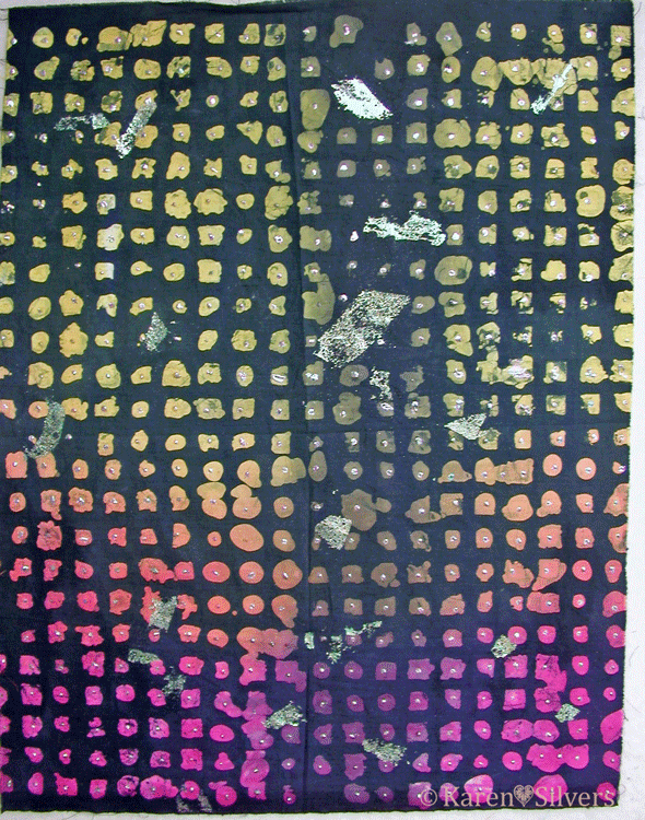
This is the final finished piece.  It was dyed, then waxed and over-dyed, then foiled twice.
 This is my final art cloth.  It started out as a snow-dyed madala, looking something like the piece on the left.  I know I took a photo of it before I sent it on its journey, but I can't find it.  Fortunately, I had two that were almost alike.

Beth from Maine was the first to get it.  She used something called "fugitive media."   Basically, it means that she used things that normally aren't permanent on fabric -- chalk pastels and water soluble oil pastels in this case -- then she painted them with base extender and heat set.  There is a much more eloquent explanation of fugitive media here at "...And Then We Set it on Fire."

Then Laura painted it with red Setacolor paint and sun-printed it using round shapes, foam cut outs and gravel from her driveway as resists.

Here is a detail showing the paint and the final foiling that Jenny did.  She followed the starburst design that happened during the original dyeing.  It's a pretty amazing piece.  I'm enjoying having it up on my design wall.

For other design walls, click here to go to Judy's blog.

Thursday, July 21, 2011

Can't Resist Resists with DeColourant

The main reason I wanted to play with deColourant was because I thought it would be great to use it with the pantry resists I have been playing with.

I took some hand-dyed purple fabric -- this fabric was dyed with blue and magenta dyes and has a really mottled purple thing going on.  Alas, I didn't do a very good job of rinsing the dyes out (it's been on my shelf since I first started dyeing and I didn't know as much about color and getting the excess dye out of the fabric as I do now.  And yes, I did fix the piece it was cut from.)

I smeared on some rice flour paste, let it dry, then painted on a thin layer of orange deColourant.  There was purple colored goo all over the plastic underneath the fabric.  I'm wondering how much this affected the action of the deColourant.

This is the back side after I hit it with steam and before I removed all the rice paste and deColourant.

 And this is the finished piece.  It's a little darker than it looks in the photo.  And some of the areas that I thought would be orange, just look kind of turquoise. Again, that might be because all of the dye wasn't rinsed out initially.


The other piece I tried was an over-dyed orange bit of cloth.  It was initially a really ugly shade of pink and I overdyed it with golden yellow to get a shade of coral.

I used the same rice flour resist as in the top piece and painted on the purple deColourant.

I ironed it with the steam iron and got some nice purple marks.

So then I did three pieces with plain deColourant and three different uncooked resists.  I used glutinous rice flour, potato flakes and AP flour.


This is from the same fabric as the top piece above.  After I rinsed all the excess dye, I covered it with a mixture of glutinous rice flour mixed with cold water.  After it dried, I painted it with plain deColourant, let it dry, then hit it with steam.  The discharged areas are a gorgeous turquoise.  There are some pinkish areas where there was more magenta dye.
 For this one, I whisked potato flakes and a tablespoonful or so of liquid laundry starch into cold water, then spread it on pretty thickly with my putty knife.  No cooking this time, but it took forever to dry in the humid weather.  I wound up bringing it in the house and letting it sit for a couple of days before I painted it with plain deColourant.  I like the patterning, but the color is kind of cold looking.   I think it needs to be overdyed with orange.
This was some plain black Egyptian cotton I bought at Joann Fabrics a couple of years ago thinking I would use it for discharge experiments.  I covered it with AP flour whisked into an equal amount of cold water.  Then painted it with deColourant.  I love that it discharged to white.

All of the uncooked resists and deColourant came out of the fabric easily.  I let them soak in a bucket for a couple of hours, then ran them through my washing machine.  I really like the plain deColourant with resists, but I haven't figured out how to get the special patterning with the deColourant that I get with dye.  I think that's because the resists that I've used dissolve slightly with the dyes and because the deColourant is more of a gel, it doesn't get into the little cracks and crannies as well.  So I guess I need to experiment some more.

 I'm not sure I will bother using the colored deColourant with the resists again.  I think I could have gotten the same result with thickened dyes, paints, or inks and the deColourant is more expensive and more steps than either of those.  But I will use the plain deColourant.  I like that it doesn't change the hand of the fabric like paint would.  And it rinses out easily -- even on top of the resist paste. 

Friday, March 18, 2011

Rice, Rice, Baby

I wasn't going to post about this.  It's more a failure than a win, but I am using the fabric that resulted from it.  So I guess I should 'splain it.

I took minute rice and cooked it according to the package directions, cooled it, and spread it on the fabric.  I let it dry, then painted on the thickened dye.  This is a half yard of fabric.


The reason it's a failure is that I couldn't get the rice/thickened dye mixture out of the fabric.  So this piece is rather stiff.  Not like cardboard, but not like a piece of good hand-dye should be.  I soaked it, washed it, then repeated the whole process.  Finally I gave up and threw it on the "hmmm..." pile.  Then I needed some bark-like fabric and I got the bright idea of using up some Setacolor paint I had stashed in a plastic container.  I diluted it, then painted it on the back of the fabric.  Then dry-brushed on some acrylic ink on the front in a darker brown.  That's the brown mess on the top edge of the fabric.

This piece is better.  I added some water to the cooled rice mixture before I spread it on the fabric.  This is not as supple as a normal hand-dye, but it isn't stiff.  I got most of the rice goo rinsed out.  This one and the next one are fat quarters.


This is the best piece.  I didn't have enough of the rice/water mixture left to do the whole piece.  So I added some rice flour that had been dissolved in an equal amount of water to the rice mixture (I think I had a half cup each of water and flour).  The goo rinsed out and this one is pretty good.  I don't think I would use this in a traditional quilt, but it will be fine for almost anything else.  And I think it has the best patterning.  It has that nice crackle from the flour in some places with the bolder look of the whole rice bits.  The background looks a bit blue on my monitor, but it's really white in real life.

Click on the pictures to examine them more closely.

It seems to me that things that are cooked stick to the fabric more than things that are not cooked.  I had trouble getting the potato stuff out of my fabric also, but no trouble at all with the rice and AP flours.  I have a package of glutinous rice flour to try next.  I'm curious to see if it will be different from the regular rice flour.

Friday, February 18, 2011

When Pigs Fly Into My Mailbox

I have been participating in a block swap with my Sparkly Chicken friends.  Yesterday, my first block arrived in the mail.  A pig on point!  With wings!  Made from bright pink hand-dyes!

(Please forgive the thready mess on my design wall.)

It's a Fat Cat design.  And it came with this adorable embroidered hippo.  My friend, Beth, who lives in South Africa and blogs here made the pig and sent the hippo.


The story that came with it is "A Hippo Swallowed a Girl."  There is lots more information about it here at Tambani Textiles.

For January, the block I sent out was supposed to have a beach theme.  So what is better than an itsy bitsy teenie weenie yellow polka dot bikini?


Only trouble was, I had envisioned a red bikini with yellow dots and couldn't find anything in my stash of dots and spots like that.  Which is really surprising because I've been collecting spots and polka dots for years.

  So I took some red with white polka dots and colored them yellow with Tsukineko inks.  Then I fused the pieces onto the beach background and stitched around the edges.


This month, my mission was a "Happy House" block.  the colors were supposed to be blues, yellows, greens and purples.

I took a house block from EQ7 and played around with it until I was happy and made this:
I used some of the fabric from the flour-resist experiments for the front walk.  And because it was for a Sparkly Chicken friend, I had to add some chicks and chickens.